 Never underestimate the power of website content positioning. Experts will tell you that getting your positioning right can be the difference between generating large volumes of business and generating none at all. If your website looks attractive and professional then potential customers will be impressed but if they can’t find your products and/or services or don’t know how to contact you, there is no point in having a website.
You’ve created engaging videos, image banners, an excellent logo and you know it is going to look great on your website. And it no doubt will look great but if you don’t position your content correctly, it will have all been in vain.
If you’re going to go to the trouble of developing great content, make sure that you position every item in the right place for maximum effect. So for example, you need to position your call to action in a highly prominent place. This is the key feature that will be converting your visitors to customers, so it is your number one priority.
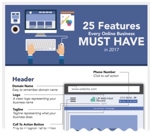
You can use this handy infographic: 25 features every online business must have, to guide you in regards to where to position all of your website’s content. From where to add your logo and tagline, to your navigation menu and what to put in your header and footer, it has everything you need to know.
If you use this as a template, you can’t go wrong with your content positioning. It can also serve as a checklist to ensure that you’ve remembered to include all of the key features that any good website should include.

